CLIENT: P&G Fem Care
MY ROLE: Design & Creative Direction
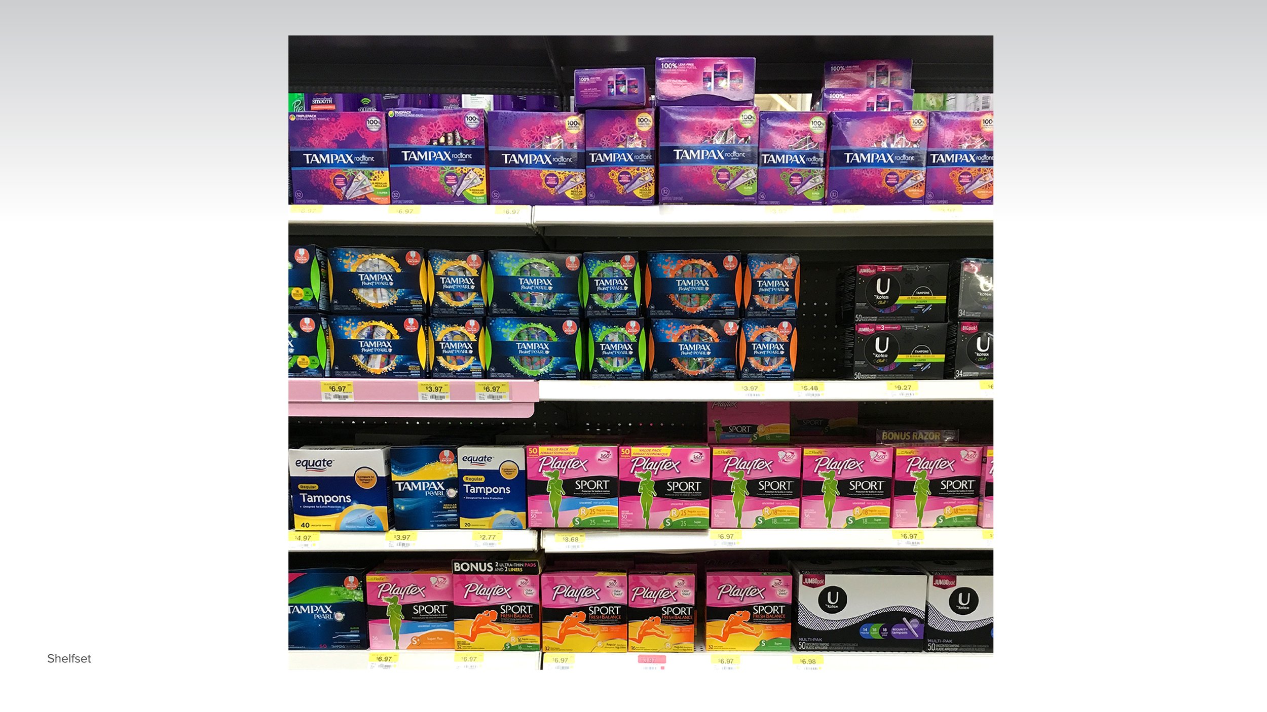
CHALLENGE: Cell phones, wallets, lipsticks—aesthetically, most essentials in a woman’s bag have evolved over time. But what about tampons? For years, the packaging stayed stagnant. My team at LPK helped Tampax & Always lean in to hear what women were saying—right when the competition started listening, too.
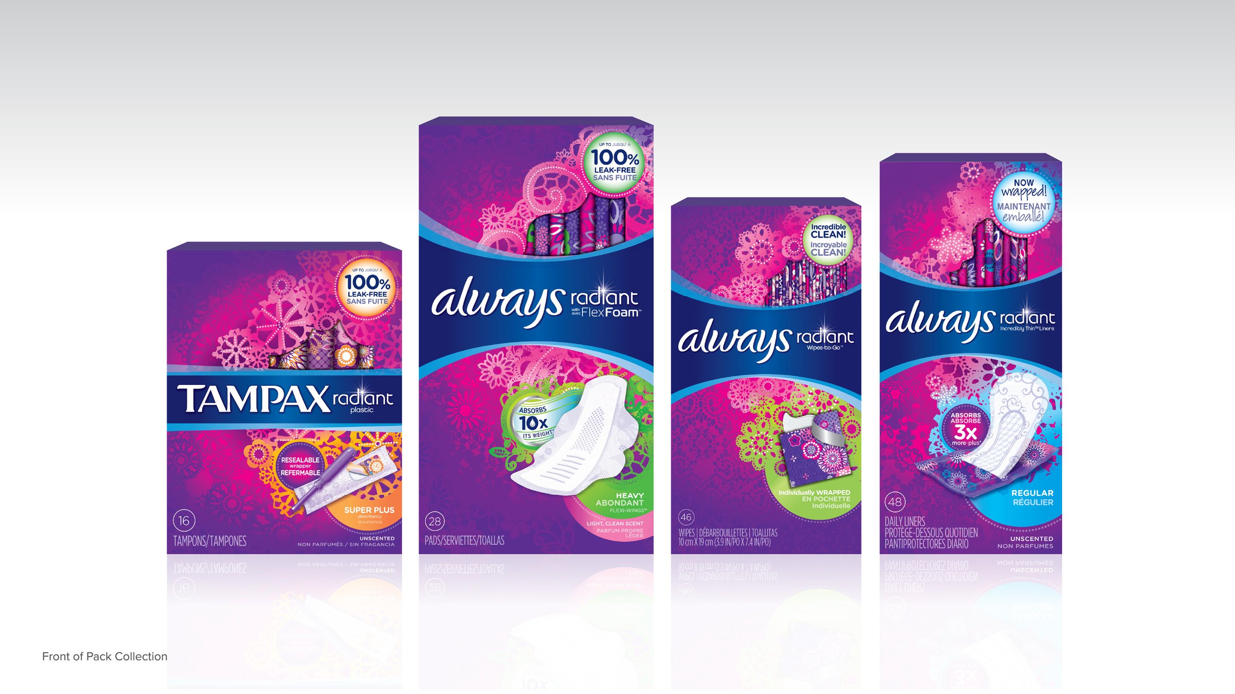
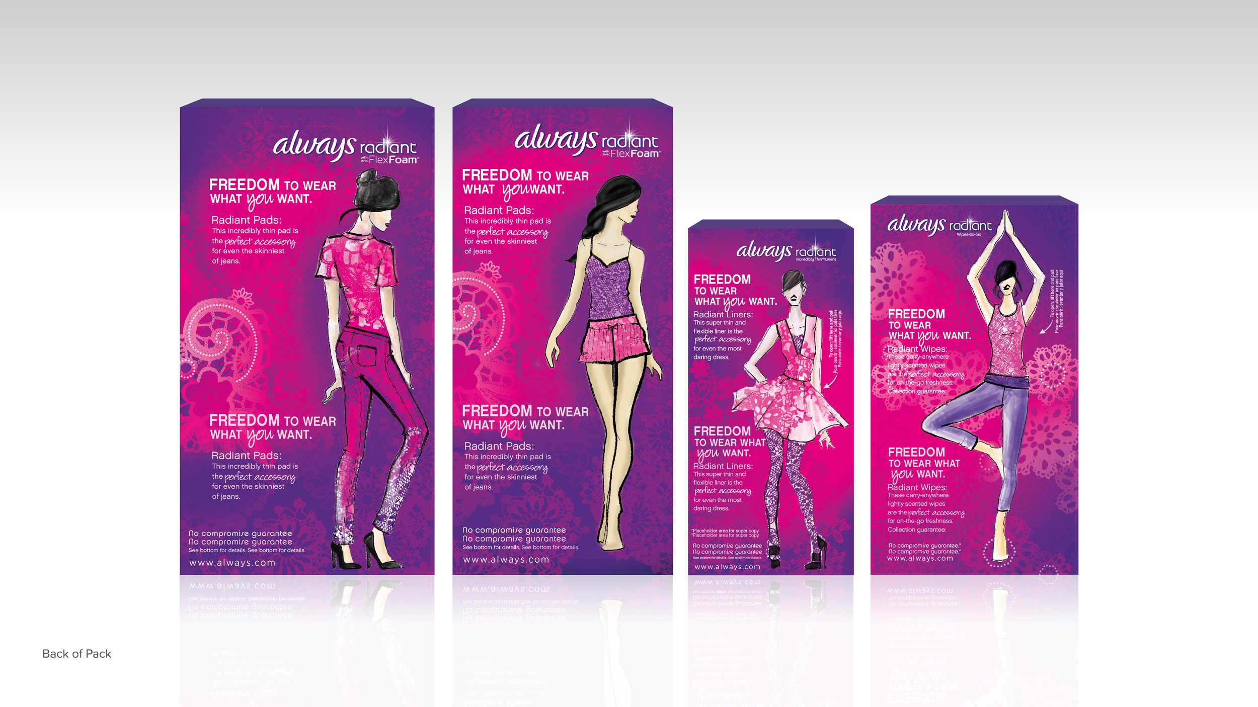
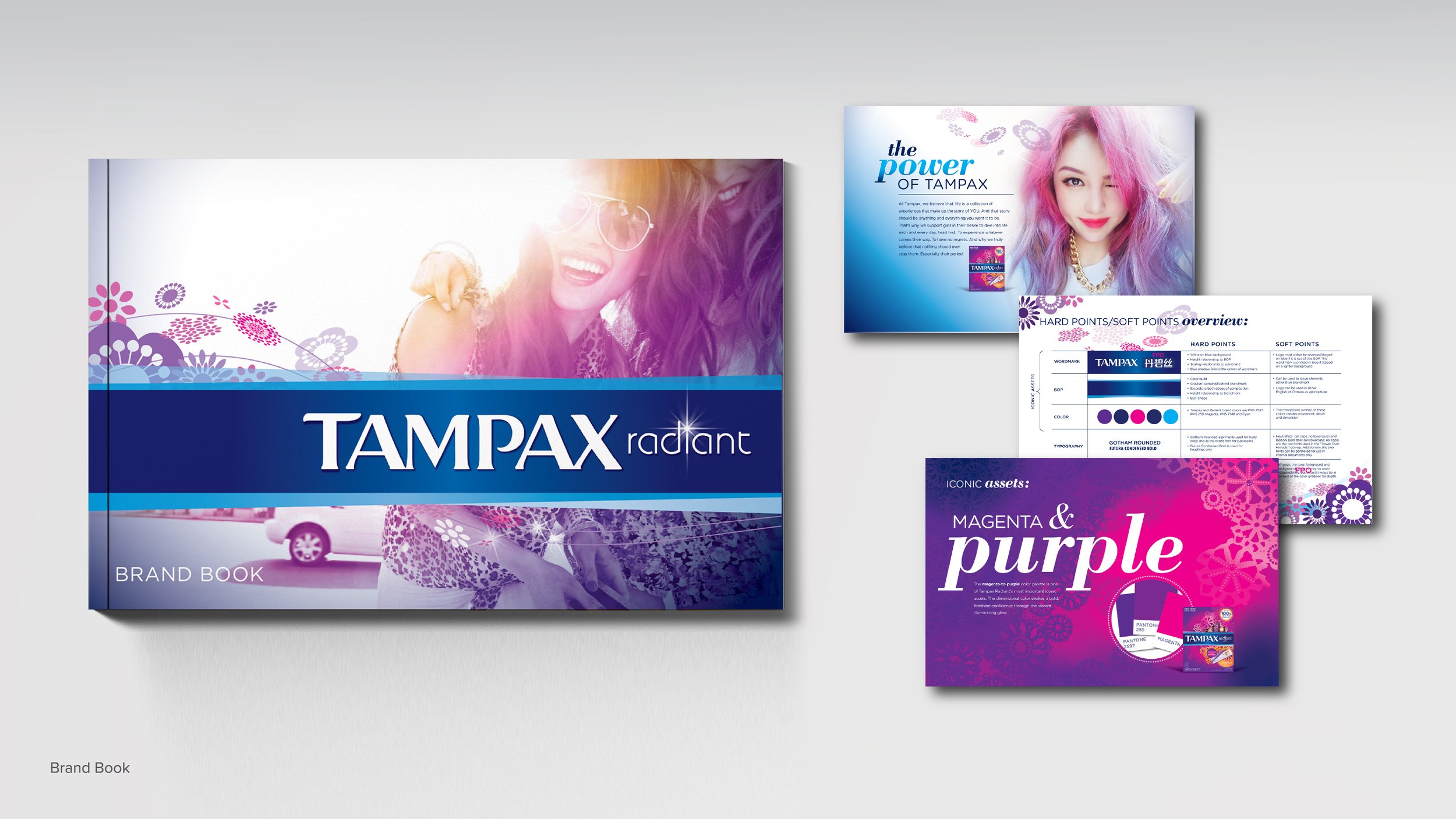
APPROACH: Consumer research revealed three key insights about tampon packaging: it needed to change, retain its femininity and better integrate into women’s lives.
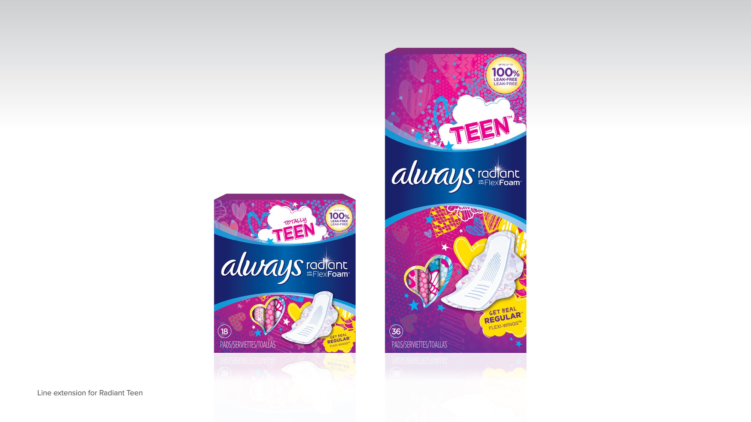
Gone were the days of hiding a tampon up-sleeve en route to the restroom—she wanted products discreet by design and beautiful by choice. Partnering with our in-house team of fashion designers, the team analyzed trends and crafted a holistic strategy and design system rooted in pattern to unify and elevate the Radiant collection. Assets took cues from the runway—graphic lacework, a saturated palette—giving women the variety and relevance they wanted, and Tampax and Always the differentiation they needed..
IMPACT: Within one year from launching this redesign, Tampax and Always Radiant gained over 30% in share, which prompted plans to launch in more retailers worldwide. This is amazing considering there was no product innovation or additional media spending with this packaging redesign.